Posts

Showing posts from October, 2017

My Logo Design

Image
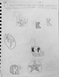
                                             The Process:   Coming up with a logo was a long, hard process. It took a lot of sketching to finally come up with something that I liked. First we started by sketching some designs. Then in Adobe Illustrator we started making black and white versions of our sketches. Then we started adding colors and seeing what colors we liked. I tried a lot of color combos before making a final decision. The three logos with color below are the logos I narrowed my decision down to.         Final Decisions: I decided to choose the logo with the Blue background and pinkish/ reddish flower. I chose this one because the colors are bright and cheerful. I wanted the fonts to be nice and neat. I think the fonts I chose are perfect for the logo. They give a sense of neatness. I tried to  stay away from the comic sans or cursive fonts because  comic sans has to be used in the right way and I didn't want to use cursive because cursive fonts aren&

Logo Color Schemes

Image
Logo C o l o r Schemes  Analogous: Sprite and Tostitos This logo uses the analogous colors of green, blue and yellow. I think the company chose these colors because they fit the flavor of the drink. This logo uses the analogous colors of yellow, orange and red. I think that the company chose these colors because warm colors like these tend to make people feel hungry and these colors are colors of things you would eat the chips with like salsa/cheese. C omplementary:  Taco Bell and Tide This logo uses the complementary colors of purple, a reddish pink and yellow. I think that the company chose these colors because they look good together and the red color makes you feel hungry. This logo uses the complementary colors of blue, orange, and yellow. I think the company chose these colors because they look good together. Warm: McDonald's and Nickelodeon This logo uses the warm colors of red and yellow. I think the company chose these colors because they serve hot